iOS : Dark Mode and Context Menus

Attention iOS users! Have you checked out dark mode and context menus?
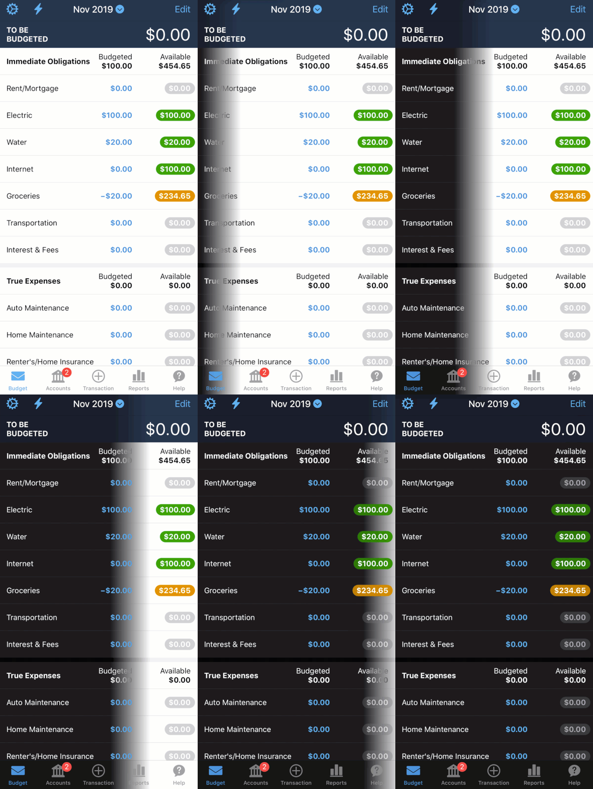
View Your YNAB Budget in Dark Mode. Your Budget goes to the dark side in DARK MODE! Think: less blue-to-red lightsabers, more white-to-black backgrounds.
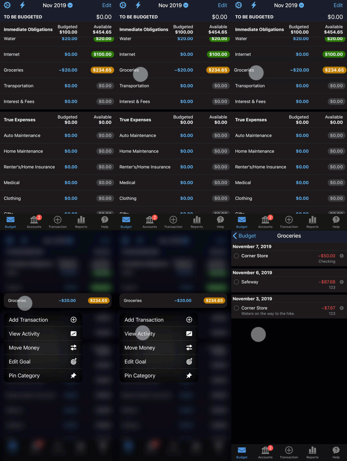
See Context Menus in your YNAB Budget. Save time and taps by using new context menus in YNAB. This means fewer taps to access those frequently used actions (like viewing all the activity for your grocery store category this month).
Let’s dive into these a bit more:
Dark Mode

What’s the point of dark mode?
Dark mode turns screens, well, darker. This is especially helpful in reducing eye strain if you’re staring at a screen all day. Plus, in the evening hours this mode is better for your sleep.
How does that work?
The blue light emitted from your phone looks a lot like daylight to your body. When that light hits your eyes, your body says “stay awake” rather than “get ready for sleep” by suppressing melatonin production (put another way, that screen light at night might be delaying your bedtime by over an hour). When your phone is in dark mode, there’s less light to send confusing signals to your body at bedtime. And here you just thought it was the money stress going down that was helping you sleep better.
For the practical among us, dark mode also preserves battery life (especially with OLED screens), and we can all give three cheers for that one!
How do I see my budget in dark mode?
To see YNAB in dark mode, change your device settings to dark mode. Your YNAB budget will adapt from your device settings. If you want to see your budget in dark mode, turn your device to dark mode (watch how here).
When your phone is automatically set to turn to dark mode at night (as iOS offers), YNAB will magically adapt to do the same.
Android users, hold tight—these changes will roll out to you soon!
Context Menus
Think of context menus as shortcuts for the things you do most often.
You can access these shortcuts using the long press (think tap-and-hold) on your Budgets screen, Accounts screen, or Transactions screen. You’ll see a list of common actions pop up when you do this fancy little press-and-hold maneuver on one of the line items.

Give one a try in your budget! We have a feeling one (or both) of these will soon become part of your regular setup in your budget.
We’re always cooking up all sorts of new features to make your budgeting life even easier. See a list of what’s new.

.svg)
.png)


